Aquis ecommerce site
Art Direction, Branding, Design System, UI/UXAquis ecommerce site
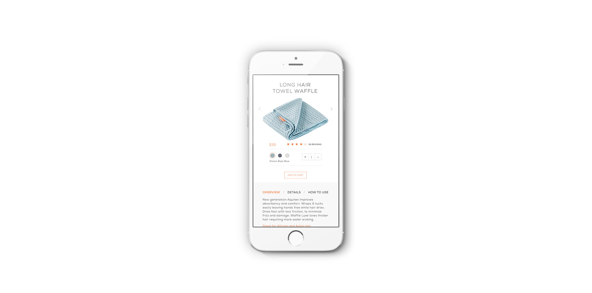
AQUIS, hair towel is specially engineered to dry hair quickly and correctly. It is made from ultra-fine fibers that are uniquely woven to create channels that quickly wick water away from hair without snagging cuticles or causing friction. The towel cuts drying time by 50%, promotes stronger, healthier hair, protects hair from frizz, and primes it for effortless styling.
ROLE
UI/UX Designer
& Art Director
DELIVERABLES
Prototype design
Wireframes
Design system
TEAM
1 Product Designer
1 Developer
TIMEFRAME
1 month
Overview
I was hired to work with a small team to redesign the Aquis, hair towel site. The existing product site did not have a clear user flow, was noisy, and lacked consistent branding (see old homepage). The biggest challenge going into this project was the timeline and scope so it was important to establish clear goals and success metrics with the client for the project.
Conversions increased by 25%. Dropoffs decreased by 58%.
Project Goals
1. Drive customer conversions
2. Improve overall site architecture & user experience
3. Improve overall site aesthetic
4. Differentiate from competitors through innovation
5. Implement a fully responsive solution
Understanding the product & Customer
Before diving into redesigning the site I researched the product, market, and space. I began by reviewing all the provided client material, doing some independent competitor research, and gathering inspiration.
Analysing the existing site
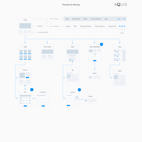
Weighed down by dense copy and repetitious content, the Aquis site needed both rearchitecting and rewriting. We met with the founders and head of marketing to do a comprehensive analysis and mapping of the existing information architecture and site. We produced a revised site map and wireframes.
Homepage Design 5-second Test
Once the wireframes were approved, it was easy to move into visual design and bring life to the wireframes.
I conducted a 5-second gut test with users to gather first impressions of the homepage and gained some valuable insights. An important one being that it needed to be more clear on the homepage that the product was a hair towel.
“I like how clean it feels”
“The photography feels like real people and not stock photos”
“It feels high-end and trustworthy”
“It took me a minute to know what kind of hair care product it was?”
Testing the wireframes
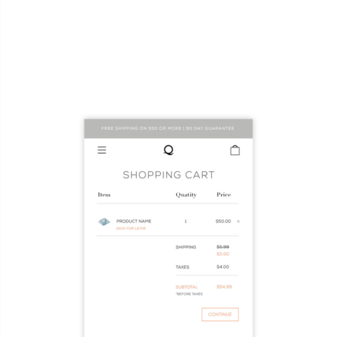
I then set up a clickable prototype using invision to provide usability insights. I asked users to complete different tasks. The most important being to add the product to the cart and checkout.
8/8 users successfully completed the task of adding items to the cart and following through to check out.
A/B Testing
Another user insight was that people were navigating away from the product page to the “how it works” page, preventing them from adding to cart. My solution was to move the “how it works” section to the product page below the fold. I created two different designs for A/B testing.
The original design with the large towel image required a lot of scrolling and did not translate well to mobile. The design with the icons had a 9% higher conversion rate.
Other insights
Explore different labeling of “hair professionals” in top navigation such as “wholesale”. Users were confused by “hair professionals”.
Put “FAQ’ in the footer navigation. 0 users went to this page in initial testing.
Put “Press’ in footer navigation or explore incorporating it as a section on another page. 0 users went to this page in initial testing.
Results
Conversions increased by 25%
Dropoffs decreased by 58%.


