Vintner’s Daughter
Art Direction, Branding, UI/UXVintner’s Daughter
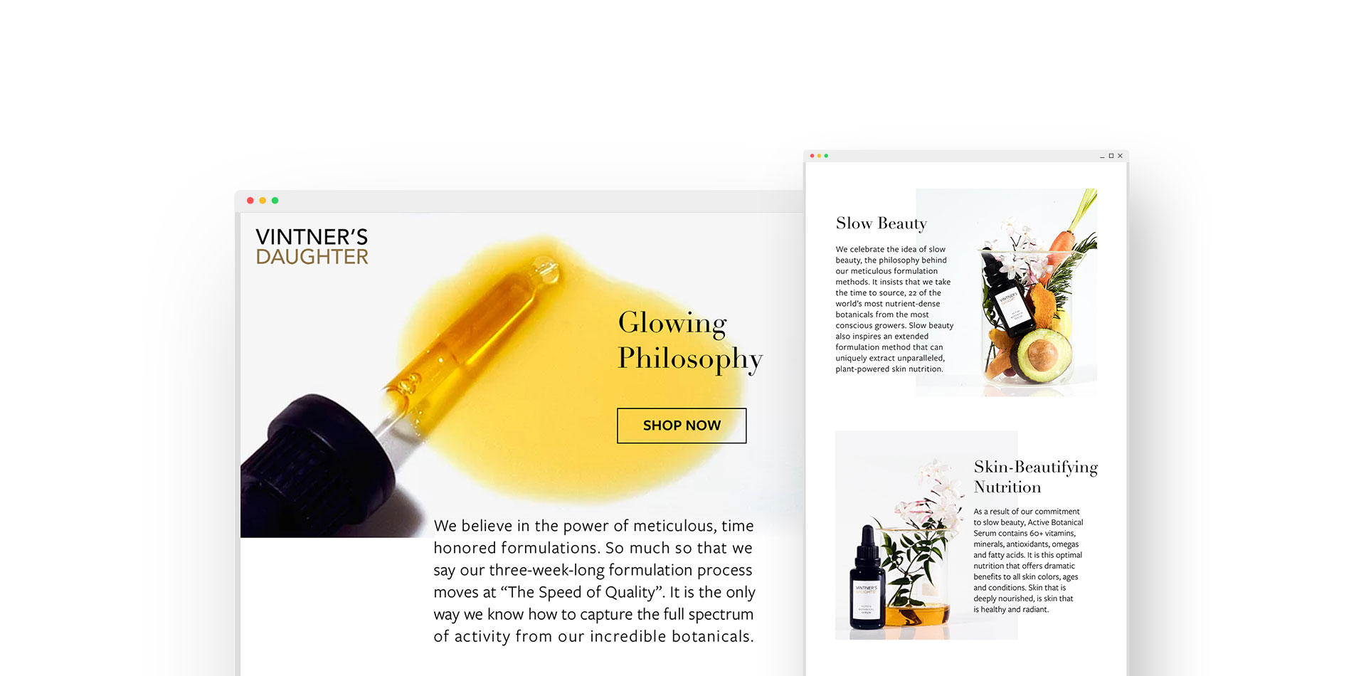
Vintner’s Daughter is a high-end, pricey, “natural,” face oil serum in a nondescript, off-the-shelf glass bottle, created by a beauty industry outsider.
ROLE
UX/UI Designer
& Art Director
DELIVERABLES
Site optimization
Email design
Photography grid
TEAM
Solo Freelance
Designer
TIMEFRAME
1 week
The challenge
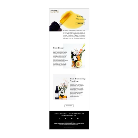
The client wanted help with UX/UI site improvements and art direction, but they had a small budget for outside freelance work. In one week, I was able to improve the brand’s overall experience with the following deliverables: small yet impactful UI/UX changes to optimize the current homepage and product page, a mockup of a new homepage design, a 9 image grid exploring a new art direction for photography, and an email design.
Photography and art direction
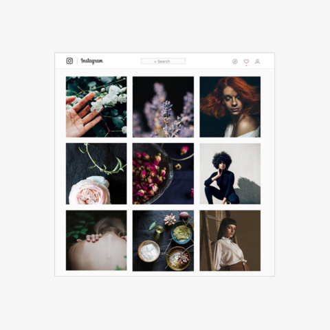
These photographs explore a new art direction for the brand’s photography. I chose images that used texture and nature to create a feeling of tactile connection and communicate the quality of the products ingredients. I also wanted the images to feel bold and have a sense of empowerment.
Future homepage mockup
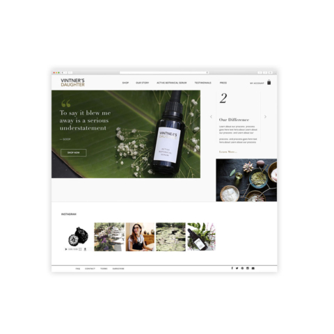
I created a quick mockup of the homepage that began to explore a layout that breaks the traditional, expected grid and had a little more personality. I created it for the client to get them to begin thinking about a larger site redesign project and all the possibilities it could hold.
Homepage UI/UX improvements and recommendations
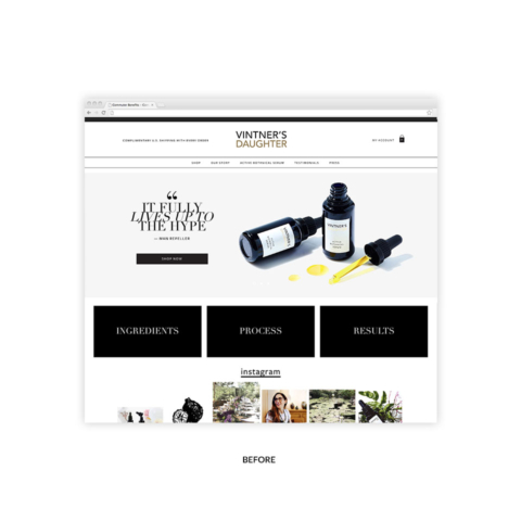
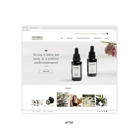
Navigation – Increased scale for better legibility. Re-arranged the layout so that it is more evenly distributed and saves space, allowing all important content to now move up above the fold.
Free shipping promotion – changed the color of the copy to create separation and hierarchy and moved it next to the shopping bag for better organization.
Black bar at the top of the page – Deleted this. The stark contrast was distracting and divided the design without a function.
Black boxes under the hero image – If these heavy boxes are kept on the homepage they need to be redesigned and have a clear message. For now, they have been deleted to create a more organic flow.
Instagram gallery – Consistency needs to be created across the gallery with similar style photography.
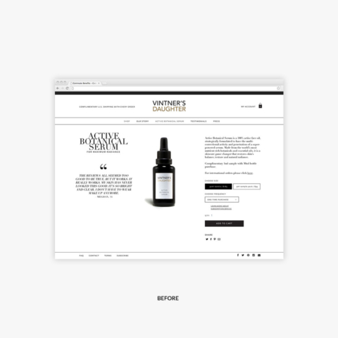
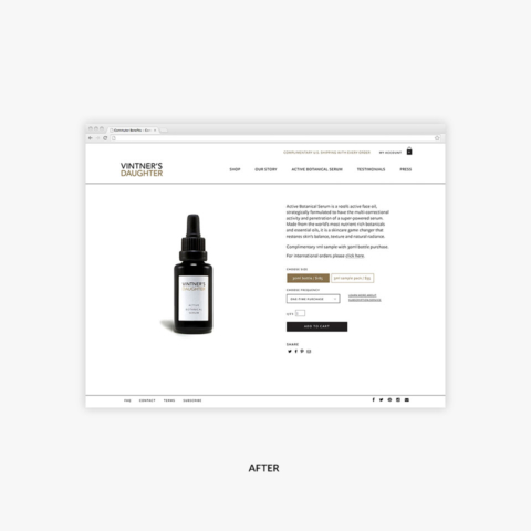
Product page UI/UX improvements and recommendations
GOAL: Make the product page clean and direct to encourage the customer to focus on the most important call to action “add to cart.”
Product description font – Was changed to a more legible, sans serif font
Quantity field – It was not clear that this was editable. A box was added around it to make it apparent that it can be changed.
Buttons – Differentiated types of buttons with the use of the brand’s secondary color, giving more importance to the “add to cart” CTA.
The “add to cart” CTA – Moved it above the fold, to assure it was easy to find when ordering the product.
The quote – Was competing with the ordering content on the right and has been deleted. The testimonial quotes were already featured on the homepage, but could also be kept on the product page if placed below the fold.


